How I update my life through my phone
I realised the previous arrangement was just wrong
Background
Here I am again after 2 months of writing how I arranged my phone screen. Well, it doesn’t take long for me to realise what I wrote was wrong (for me).
After having the previous setup, I still found myself spending time on using apps I should minimally use (read Youtube) or finding an app in time of need. I began to ask myself if something is not right.
New system
This new system I come up with (I’m not sure if someone has ever come up with it before) is to answer two questions:
1.If I have to strip off all the unnecessary activities, what do I use my phone for or what should I push myself to use my phone for?
2.Now, beyond those basic tasks, how often I want to engage in the extra activities?
To me, the second question is a realisation. I realise that grouping app in categories is not correlated with how I want to spend my time. Last time I conveniently grouped my trading apps with my bank apps, but I created my own anxiety by checking the trading app out of convenience.
First screen - Basic tasks
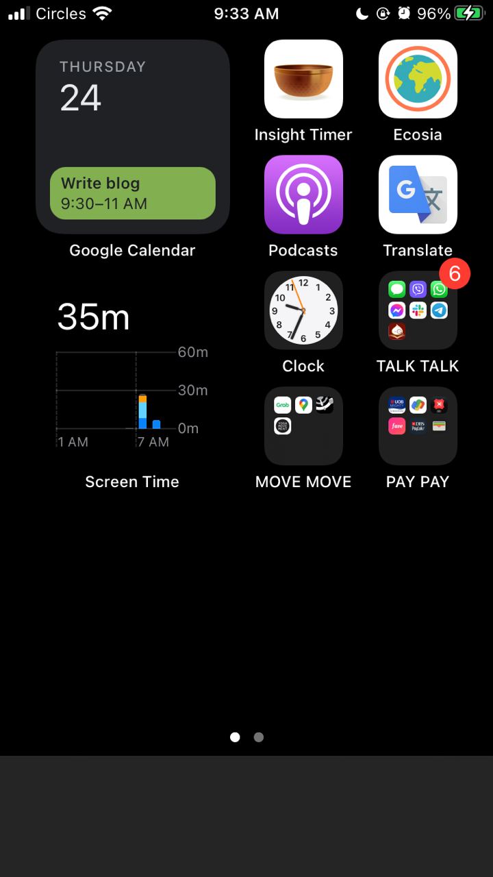
On the left side, I create 2 widgets, one for my calendar that shows the next activity and one that shows my current time spent with the phone. I try to cut down to 1 hour 30 mins everyday.
My basic tasks are in my first screen. They are: (1) Insight Timer (meditation app): Part of my self-care routine. I use the app every morning.
(2) Ecosia (eco-friendly web browser): Part of my news update routine. I use it twice a day just to read news, each like 5 minutes. Ecosia’s mission is to plant tree for every 45 times I search/use so I fully support them.
(3) Apple Podcast: I use it once a week during my 3 hour meal prep time. Putting it there to remind myself to do it.
(4) Google Translate: I probably use it once a week when I self-study Korean but I want to put in my first screen to discipline myself.
(5) Clock: To set alarm clock for my 10 min nap.
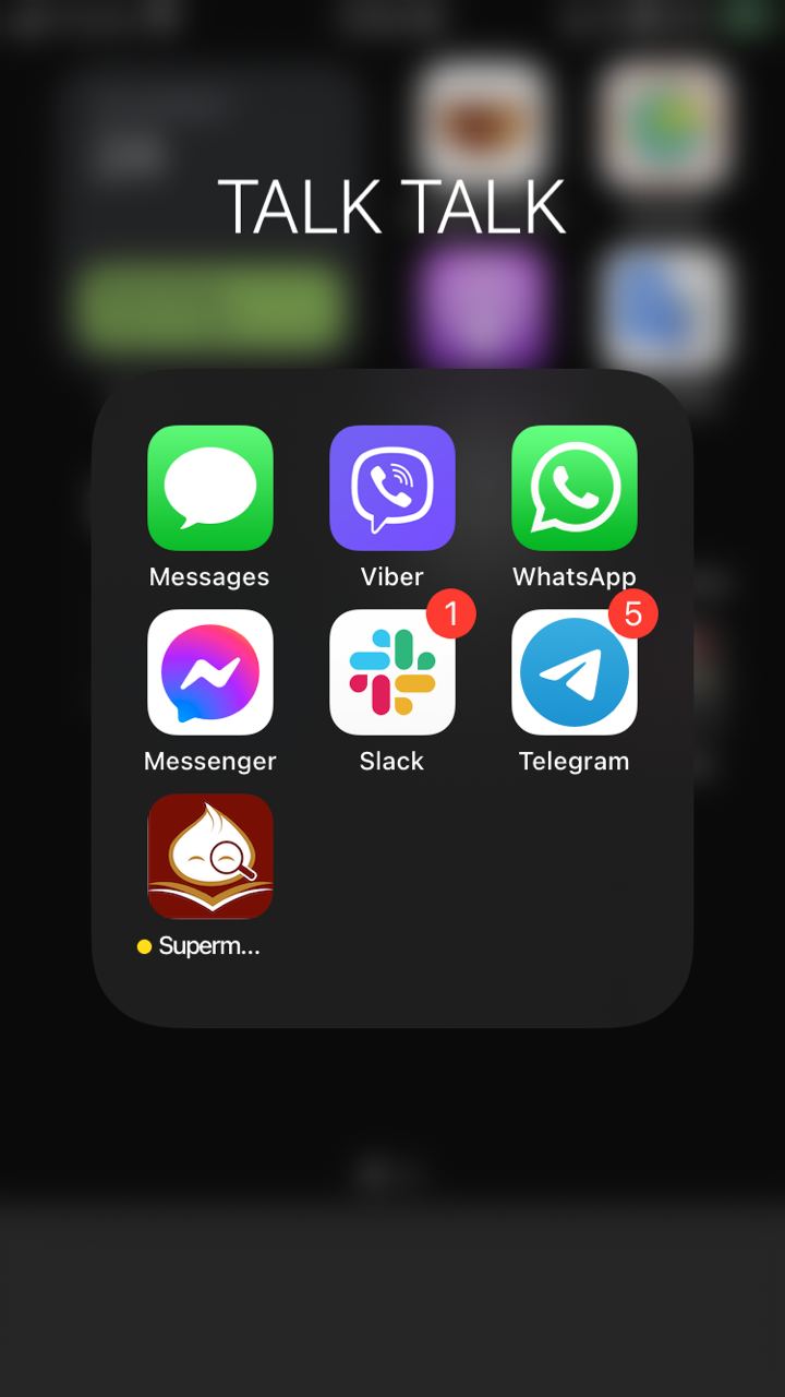
(6) Group Talk Talk: Frequently used the messaging apps (Whatsapp, Slack, Telegram etc.).
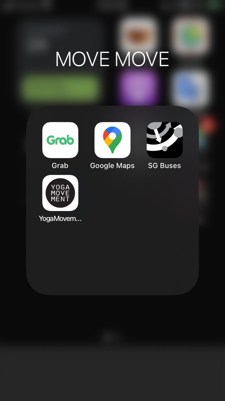
(7) Group Move Move: Frequently used travel / exercise related apps (Google Maps, SG Buses etc)
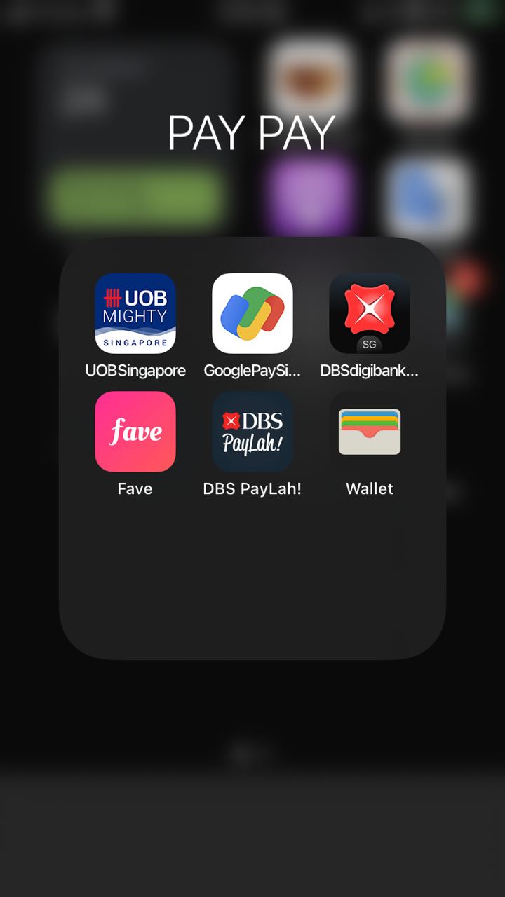
(8) Group Pay Pay: Frequently used payment / bank apps
Second screen
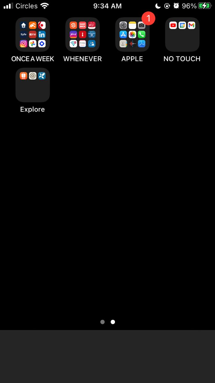
This screen is set up with 4 groups + 1 group (explain later). The 4 groups are how often I should use these apps.
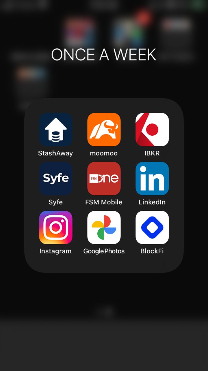
(1) Once a week: Here I put my trading apps, social media etc. I check through them when I relax on my sofa on weekend.
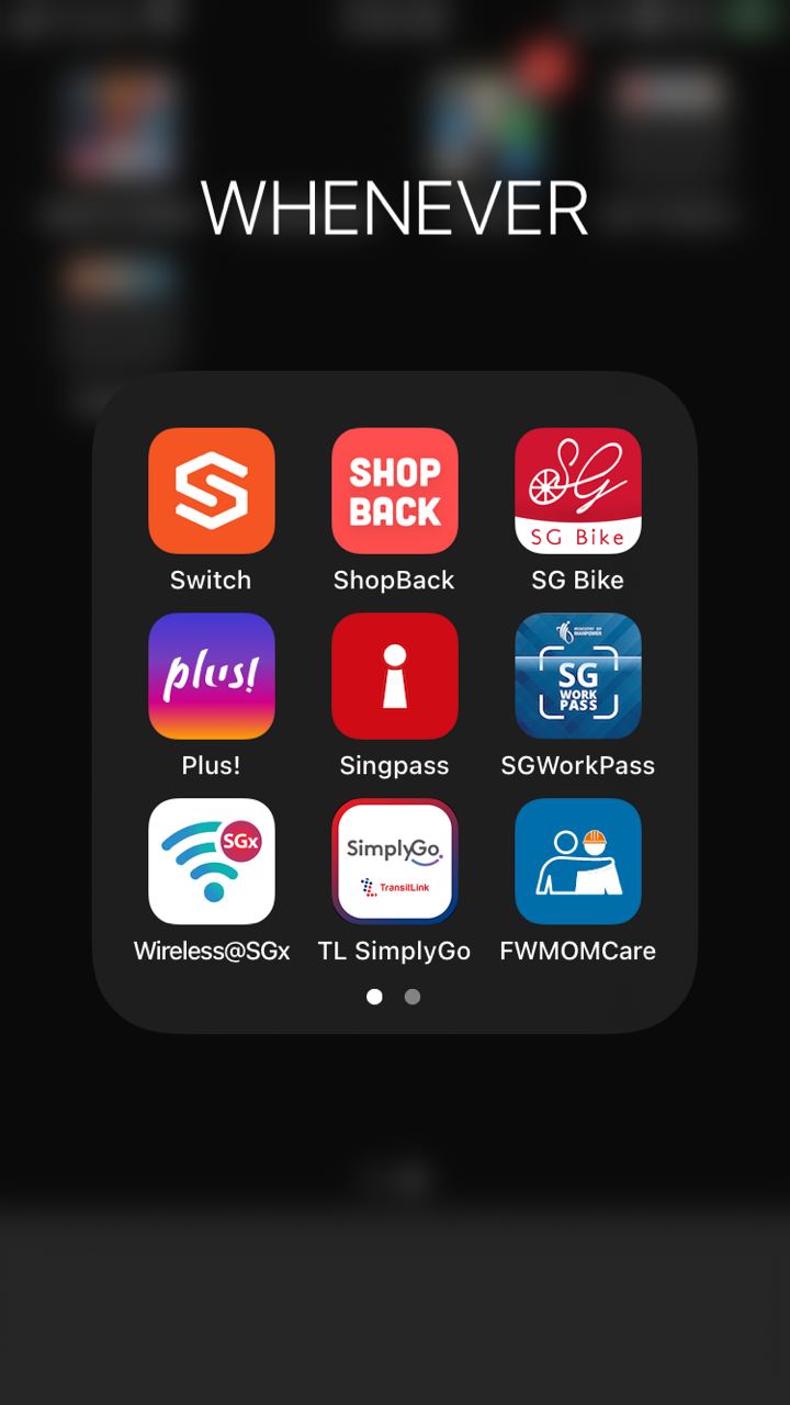
(2) Whenever: These are the apps I have to use to go to places or settle admin work (e.g. Trace Together). In another word, I have to use them on demand when I’m asked to. I usually access them via Search function.
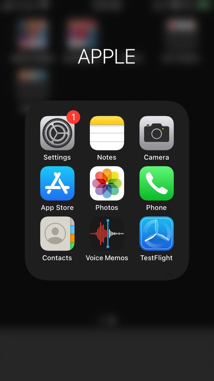
(3) Apple: These apps are Apple apps, some cannot be deleted or some can be important but I don’t use often like call app (which is strange to say).
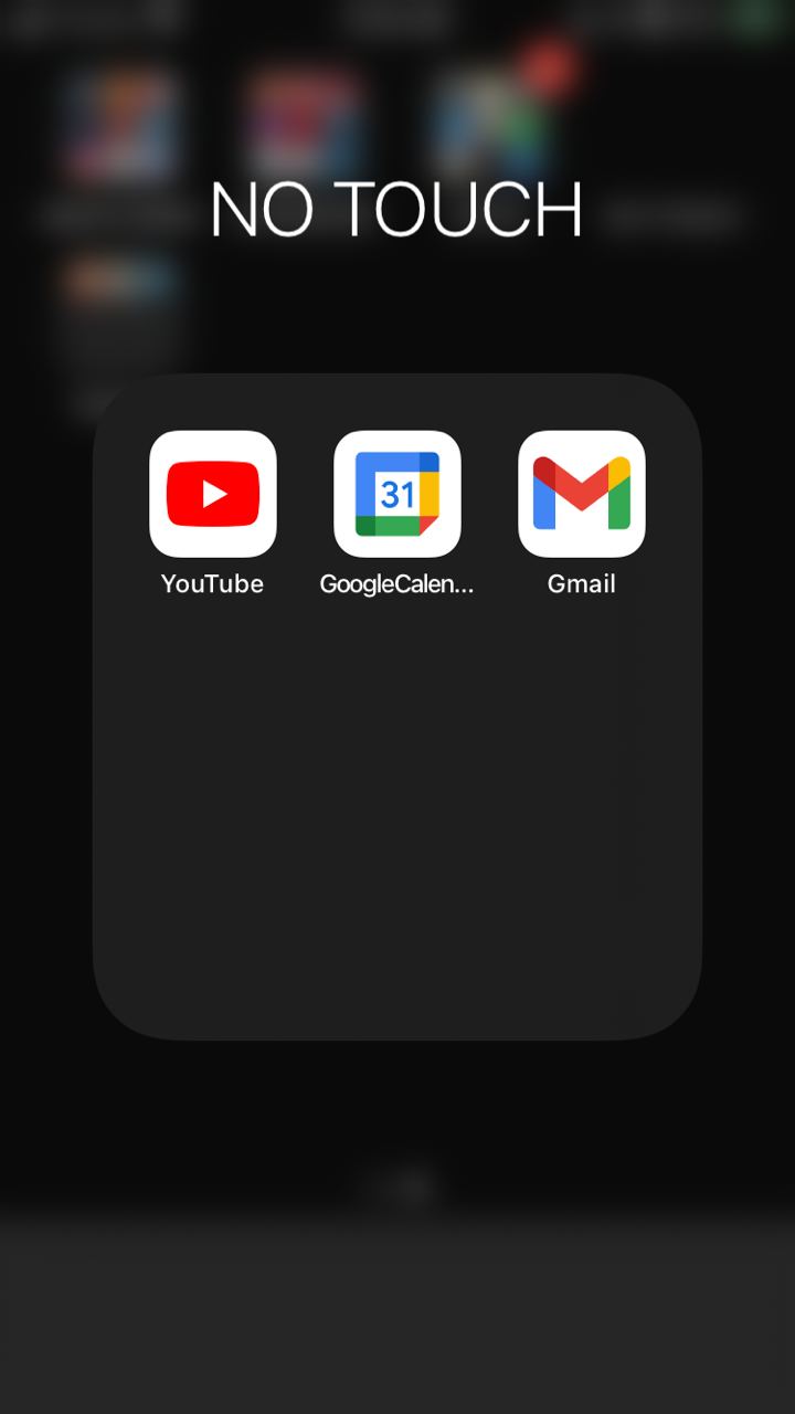
(4) No touch: This is my guilty group. I put youtube, gmail and google calendar here. Those apps are time sucker if I don’t plan time for them and I know well that I can settle them via my desktop. I hope by writing “No touch”, my brain would hesitate and move on.
(5) The last group is Explore. Though I don’t want to have many apps, I tell myself I should still Explore new apps if there are anything better. So this Explore group is for me to try out apps before I decide to delete them or move them permanently to my phone.
I feel this set up frees up my mind a lot as I don’t really see the app category, associate what app is inside and think if I should check something quickly. If I have free time and want to play with my phone, the apps in the first screen can easily fill that up.